In a previous post, I lamented my struggles with color–specifically, finding a balance between grays and pure color. I received good feedback in comments (thanks Jan and Bart) and made changes to the painting (see before and after images below). The changes may appear subtle, but I think the graying down parts of the painting made it more realistic and interesting. Thanks for your help!
 “Near Devils Slide” BEFORE |
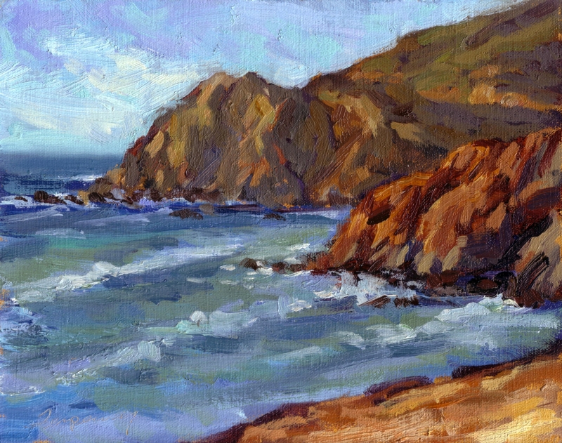 “Near Devils Slide” AFTER |
The first one is more pure and has better colors. I like the before best.