 I spent last week in sunny Scottsdale, Arizona inside a classroom with 4 other enthusiastic students studying with Kevin Weckbach. Kevin is a generous teacher who both paints well and can explain his thought process thoroughly. As you may know, this is a rare combination!
I believe I first saw Kevin’s work in the annual OPA catalog. Among the hundred or so predicatable paintings, there are always a few that sneak past the jury and scream originality and true honesty. That’s why I wanted to study with him. I wasn’t expecting a lot, because my assumption was that someone this original probably can’t explain how it he does it, but he does so well.
I’m not alone in my assessment of his teaching ability. Kevin teaches at the Art Students League, Denver, where he took over Quang Ho‘s class (and where he maintains a two year waiting list). This post includes my class notes, his demos, and some of my own painting studies from the class.
Levels of an Artist
As artists, it’s difficult to measure where we are in our growth, in contrast to other professions that offer levels of certification, by testing practictioners for an agreed upon set of skills. Kevin described the three levels of an artist:
- This artist sees subject matter in terms of facts, much like a computer scanner at the market may recognize a can of Coke. There is no interpretation. It is what it is. Many early art students see this way. When they see a landscape, for example, they see a tree, another tree, a rock, another rock, and so on. They don’t see and represent a unified picture based on an overall impression, but rather break the objects down into things they can name. That’s way many teachers will tell students to “squint down” when they look at a landscape, so they’ll see the big shapes and values, and not assign names to objects. Assigning names is dangerous! When you do so, your trees will always be green, even when they’re not.
- This artist sees subject matter not as objects, but as components, with color, value, texture, and most importantly, knows visual approaches to represent it. This artist intellectualizes the subject. They can use a visual approach to design a painting for a subject. They make think through many alternative approaches before they decide which is best. This level sees the can of Coke as a value shapes, texture, and other painting abstractions.
- This level sees subject matter with an intuition. Quang Ho describes intuitive as “gentle awareness”. At this level, you don’t have to think about how to represent the can of Coke, but can lay down paint within the right visual approach best for the subject. Color, value, drawing, texture, all the things that I know I think about when painting are second nature to the intuitive level. When you’re driving home from work, do you think about which turn is next and what street is next? The intuitive artist has such a foundation of skills and memory, that he can represent more than the basics, without thinking about it. For me, the surest sign of an artist at this level is the honesty they convey in their work. In Scottsdale, we went for a gallery walk, and saw lots of dishonest art: paintings forumulated to sell. Great technitians, but you can just feel the lack of heart. VanGough is a great example of what I think of as an honest painter, which is why (unfortunately) true art and commerce rarely work.
If we all had one system of painting, reaching the intuitive level would be great, but what makes things interesting is the fact that we can represent subjects in a wide variety of visual approaches. We’re not cameras, we’re artists, so when we paint, we seek to convey how we feel about a subject. If there were only one way to represent a subject, every painting of the Grand Canyon would look the same. Originality comes about when we combine our feeling for a subject with a visual approach to represent it.
Visual Approaches
So what’s a visual approach? As you can imagine, there are many ways to approach painting a subject. Kevin taught 4 of 10 visual approaches to painting. The 10 include: Dark by Pattern; Local Tone; Light & Shadow; Line; Texture/Pattern; Color; Shape; Form; Siloette; and Front Lit. Each approach has its own set of “rules”, but the main point is that they provide alternative ways of seeing subject matter and representing it in paint.
 Local Tone
This visual approach is characterized by:
- A limited set of values (generally, 3: light, medium and dark) represented by large, whole/complete shapes.
- Value groups are relatively close together, resulting in a flatness.
- Edges are created by adjoining value shapes.
- Each value group maintains their integrity, eg a “medium” value group will generally have some slight value variations, but not to the point where it “jumps” to another value group, eg, the light or the dark.
This approach may be good for representing:
- A grey, overcast day in the landscape.
- A figure with no single, strong, direct light source.
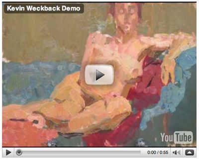
The Mary Cassett painting above was offered as an example of this approach. It has three clear values, with only slight shifts within them: the light (bed linens, clothes, china), the mediums (table, skin tones) and the darks (hair, back wall, etc). You can see how each value creats a path for they eye, and is virtually connected. Kevin’s demo below shows how he approaches painting in Local Tone. Click the YouTube video below to watch.
 Line
Line
This visual approach is characterized by:
- Lines that divide space and create shapes.
- Lines that are unique, have character, vary across the painting in size, character, etc.
- Lines are used to lead the eye throughout the composition.
The Willem De Kooning painting “Excavation” was offered as an example. Kevin spent the least amount of class time on this approach, so I don’t have demos or more examples to show. I’m also not entirely sure when one would select this approach over another.
 Dark by Pattern
This approach is characterized by:
- Two value systems (although I would argue the example used on the right (“Wolf Moon” by Andrew Wyeth) is a 3-value system.
- A well organized network of light or dark shapes lead the eye.
- There is shape harmony, ie, the shapes vary, but they belong together (eg, see the white snow shapes in “Wolf Moon”)
- The value/shape that is most connected holds the design. This can be either the light or the dark.
- The leading value (dark or light) is the one detailed or broken down.
- Very little/no modeling.
- Patterns are each unique, yet create a pattern with variation and a rythym that leads the eye.
- Best used to represent bold, stark statements. In addition to the Wyeth painting on the right, other examples included Motherwell‘s bold black & white brush paintings)
I painted a Dark by Pattern painting below.
 Light & Shadow
This visual approach is characterized by:
- Painting design based on a clear division of light and shadow shapes.E
- Either the light or shadow “tells the story” of the painting and is detailed out (color, value, texture), while the other remains relatively flat.
- Local value and local color applied to shapes.
- Begin by blocking in light and shadow shapes in a medium, average tone.
- Highlights should be consistent across the painting. Accents (darkest shadows) used to help define the figure in the early stages of painting.
- Shadows unified color and value-wise, to hold the painting together.
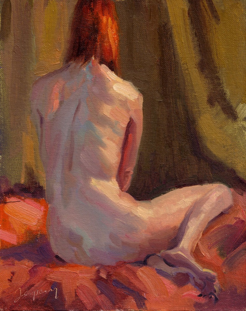
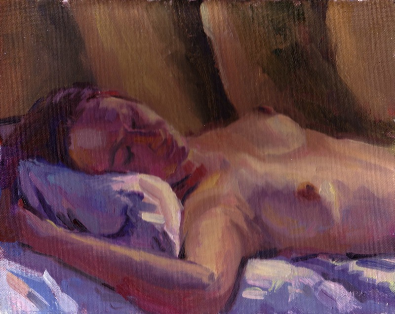
I painted two Light & Shadow figure paintings below.
General Notes
- Drawing. Good drawing isn’t precision, it’s about spatial relationships; uniqueness in shape, line and edge quality. The first thing to go wrong with a painting is the drawing.
- Paint. Kevin started with thin paint, but without much/any thinner. After a solid block-in, he removes excess paint with a painting knife or towel (to avoid the underpainting mixing with the top and creating mud. He created nice big piles of paint for the large shapes, that you can then bend in various color directions (warm, cool, gray, etc..see the video). Don’t overmix color, keep some variations to make the paint more interesting. To get a highlight on a shape, mix the base shape color, then touch one side of the brush on the highlight paint and lay a flat stroke that mixes both colors on the canvas.
- Focal Point. He’s often start with the focal point of the painting, get the detail and key relationships working, then work outward. Focal point can be created by gradation of shape, eg, more detail in the focal point, less as you move out from the focal point.
- Figure. One reason to keep the initial drawing of a figure broad and flat shapes, is the model will typically set into a more comfortable pose after their first break. Painting a comfortable model shows in the painting.
My Workshop Studies
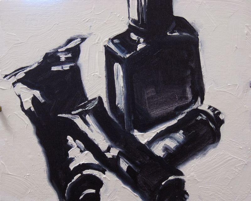
Dark by Pattern Study |
Paint Tubes & Liquin Bottle (Dark by Pattern study)
|
Light & Shadow |
Really great, well annotated post, Ed. You are such an incredible note-taker of these workshops. Thanks for sharing your experiences with those of us in freezing Virginia who can’t make it to Sunny Arizona at the moment!
Thank you, a very interesting post. But aren’t these visual approaches to some extent compatible with one another? Just as an example, the next in my Google Reader was this “postcard from Provence”
http://shiftinglight.com/2009/03/still_life_with_bottles_and_red_apple.php
which seems to combine a strong three-value pattern with a light-shadow statement within the middle value — that’s my take on it, anyway.
(Have you noticed, by the way, that Van Gogh has some paintings which seem to lack value pattern almost completely — if you turn them to gray scale, they all but disappear; the whole story is told by hues & brushstrokes alone — I wonder what visual approach that would be.)
Another question related to your post which I’ve been struggling with lately is whether it is actually easier, in a sense, to be honest in painting when you know less (e.g., have less technical tricks internalized). To give an extreme example, a painting toddler is always absolutely honest. The more “short-cuts” to a visually strong statements you have, the more tempting it seems to be to avoid a harder path to the genuine honesty, even if it is not exactly your goal “to sell”.
We didn’t review all the visual approaches that Kevin teaches, but my guess is Van Gogh would propably be either the Color or Texture approach.
But you’re right, in that these approaches are related AND a good painting can use more than one. I guess the point is that one should be dominant for a strong visual statement to work. I’m not even sure how I’d categorize some of my paintings in these various approaches, it’s still new to me.
Good point re honesty. I think there are honest paintings possible from either someone with tremendous, intuitive skill, as well as someone who doesn’t know anything about approaching painting. I guess if you’re at the Intuitive Level in painting, you have a stronger shot at honesty, as you’re thinking less about the physics of paint.
Ed, great paintings!! I can feel your passion!
Thanks for sharing this with us, your work and experience. I had never heard of Kevin before your talk of going to his workshop and I will now keep an eye open for his work as I am magnetized to honest paintings.
Lovely studies you did, and thanks for the informative post.
yes very interesting post ed
feel like i just got a free workshop!
thanks
I have to read this but am off to work _ I love his work and have two small originals. Smart to take his class I think it was good for you.