“Think in black and white, but paint in color.” – George Post“I want all my senses engaged. Let me absorb the world’s variety and uniqueness.” Maya Angelou
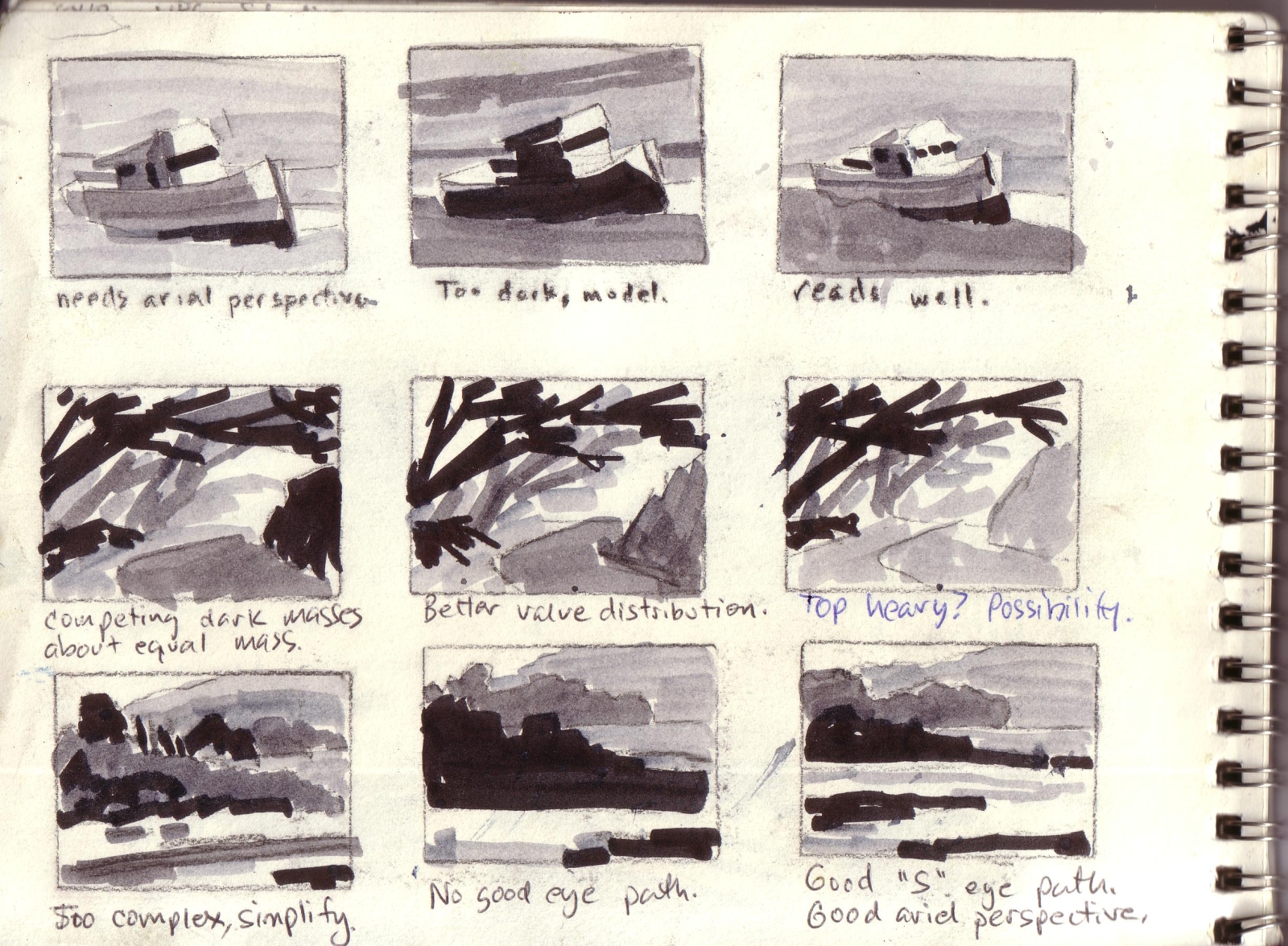 In every workshop, there are usually just a couple of things I come away with remembering forever, that really stick in my sieve of a brain. From Camile Przwodeck, I learned the concept of “color separation“. I don’t think she ever called it that exactly, but the idea is somewhat analogous to value separation: The uneven distribution of and planning of values (from 3-5, generally for me) is used to design something pleasing to the eye. In my “Observation 2: Design in Abstractions” post, I wrote about my use of Notan Sketches to abstract a scene into a limited number of values, and to keep one value dominant, the others supporting (see the Notan Sketch on the right).Just as you need to have a clear separation of values to make a design work, so too color. Just as the eye responds to abstract value shapes, it apparently does the same with color. In my recent post about the physiology of the eye, Margaret Livingstone describes our visual system in which different colors are handled by different cell types. The reason complementary colors create a sort of visual “vibration”, is because the two visual systems/cells in the eyes are actually competing with one another to see the scene. That “fight” causes the vibration. The book describes many other types of effects like this that I can see myself experimenting with for years.In practice, here’s what color separation means:
 If you think you see two greens that look about the same, exaggerate the difference between the two, to separate them easily for the eye. For example, in this plein air sketch of ice plant in Pacific Grove on the right, to create the greens in light and greens in shadow, I used completely different base colors. For the green in light in the bushes on the left, I used Hansa Yellow and Cerulean Blue, and Ultramarine Blue and Hansa Yellow Orange (and a little Alizarin Crimson) for the shaded side.
- Don’t use the same color to represent two different objects in a scene. For example, if I’m painting a red barn, with a pot of red flowers, I will use two different color combinations to create the two reds, with no colors in common . So I may paint the barn with an Alizarin Crimson base color and lighten with a Cadmium Orange, then paint the flowers with Fire Red and lighten with another color, such as Cadmium Yellow Medium.
- Avoid lightening colors with white, especially if you want them to be vibrant. White KILLS color, but is very effective in a gray-day painting! Use the next lighter value and warmer color on your palette. See my previous post on gray-day vs. full-sun painting.
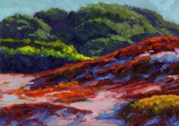
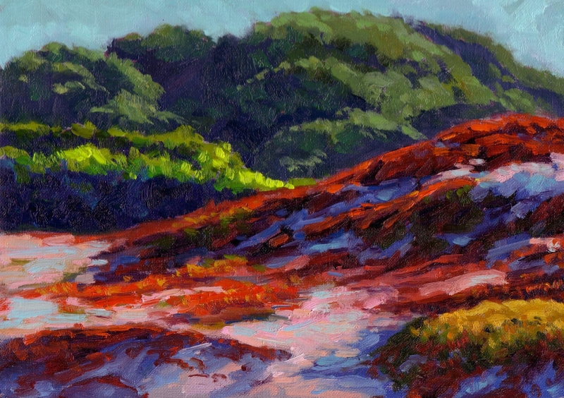
- Just as I would design a value plan with a Notan Sketch, I design a color scheme with a dominant color, and then limit the number of supporting colors. For example, the painting above is basically a green dominant painting with reds a close second, followed by light pink/yellows.
- After a basic drawing, I will often start with small color spot tests to represent each object, and see how they work together (harmonize) before painting the entire area. This is something I learned from Barry John Raybould (see Virtual Art Academy) when painting landscapes, and Jim Smyth taught this technique when painting the figure as well, in which we’d paint tiny (2″ square) color spots to represent the figure in light and shadow.
- With a full palette of paint, and trying this technique, it’s really easy to go overboard and create a painting with no color harmony or with no color shapes that hold together to create a coherent painting. I see this a lot in florals. Although I have 13 colors on my palette (plus white and black), I won’t use them all in the same painting! If you’re a beginner and just learning how to get basic values accurately, I would not use this technique. Save it.
In summary, while you’re in the design stage before you’ve laid down a stroke, analyze your subject and think ahead about a color plan. Use color separation to create paintings with a vibrancy that will challenge the human eye.
This is the 5th in what will be 10 total “top observations” of mine as a plein air painter. Click here for an a list of the others.
Thanks for this information. It’s really very helpful. I Off to check the rest of the series–and then do a color plan for my next painting. Judy
Interesting and valid observations, Ed. Good stuff to digest and go out and play with. In the workshop with Ray Roberts I took the other week, Ray noted that he “color codes” his canvas. That is, if he’s painting a palo verde tree, he will use one green for that; if the same painting also has sage, he’ll use a different green, and so on. Every species of items gets its own color code. He won’t use the green for the palo verde tree in the sage. Of course, he will modify that green if the palo verde is closer or farther away.
Michael, your comment about Ray Roberts’ approach is really interesting. He does the same thing, and based on your posts on your workshop experience, he paints with enough colors to have this degree of color separation.
I wil have to watch him paint…we’re in a show together next month that includes a group paint-out for the public (“Gold Country Plein Air” at The Vault Gallery in Sonora, CA).
Have really been enjoying your very observations about observation! I also enjoy using notan sketches to plan my values and distill design. In addition to your already astute comments about color, I would agree that it isn’t important to match a color per se, as long as the color relationships appear correct. This is especially true when you are limiting your palette and you can’t always get the “exact” color. I always try to remind myself to compare, compare compare–one value against another and one color as it relates to the others.
What a nice site, been surfing on it for the whole night and day and i neva got bored for a single minute. Keep up your good work and all of the best in everything you do! 🙂