It’s been a wonderful couple days here at Hearst Castle for the invitational. The artists and staff of the castle have been great. I can’t wait to see everyone’s work framed for the show June 5. Tickets are available for $175 for the Friends of Hearst Castle’s “Twilight on the Terrace” fundraiser benefiting art programs for at risk youth.

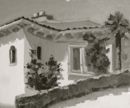
My first effort was painting “Casa del Mar”, a guest house on the South Terrace of the castle. I got to take a peak inside…wow. Opulent doesn’t begin to describe it. Hearst himself spent his final years in this house. This is just about done, I think a couple minor tweaks when I get back to my studio should do it.

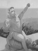
My next effort was painting this white marble statue, which I imagine is Cupid (sans arrow). While in full sun is always a joy for me to paint, as white takes on so many colors and reflections of light. I’m not sure the color of reflect light is quite right, so I may make some adjustments before I call this one done.
, Oil on Linen, 12x9")
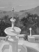
And on my final day, again on the South Terrace outside Casa del Mar, I painted this fountain and gold statue of a princess holding a frog. I realize the princess statue on top looks like an Oscar statuette, but that’s really what it looks like! Even the shadow side on the gold had a red glow. I’m happy with this one. It’s interesting to me because it almost looks like two different painters/styles: the fountain is high-key, colorist, and the background trees and distant shore are more traditional value painting.
, Oil on Linen, 12x9")
As you can see, all of these paintings push color a bit. With full sun available, I didn’t paint much tonally. To make sure these colors are still on track, I look at the images in black & white as well. If light and shadow read well in black/white, it almost doesn’t matter what color you choose to paint (see my 2007 post on values). I think the light/shadow patterns read in this black/white versions, so these seem to be working.
 |
 |
 |
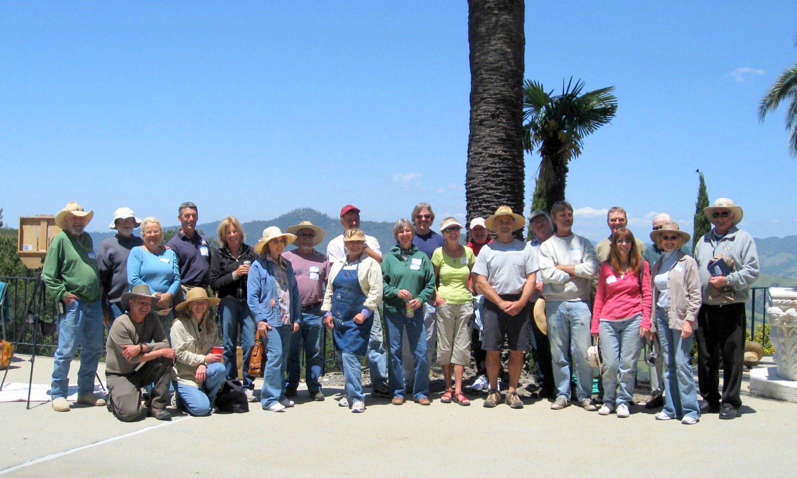
And here’s the group of painters.