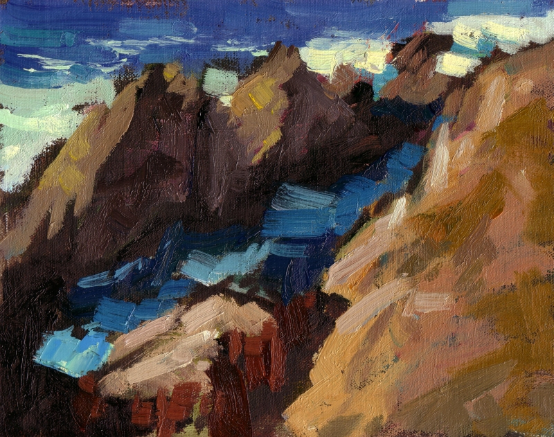
I have been experimenting with different painting keys. “High key” paintings (like the seascape below) are painted with pale, light values, and according to this website, can be either high or low color saturation. My paintings tend to be on the dark side, because it allows me to use full saturation colors for the lights.
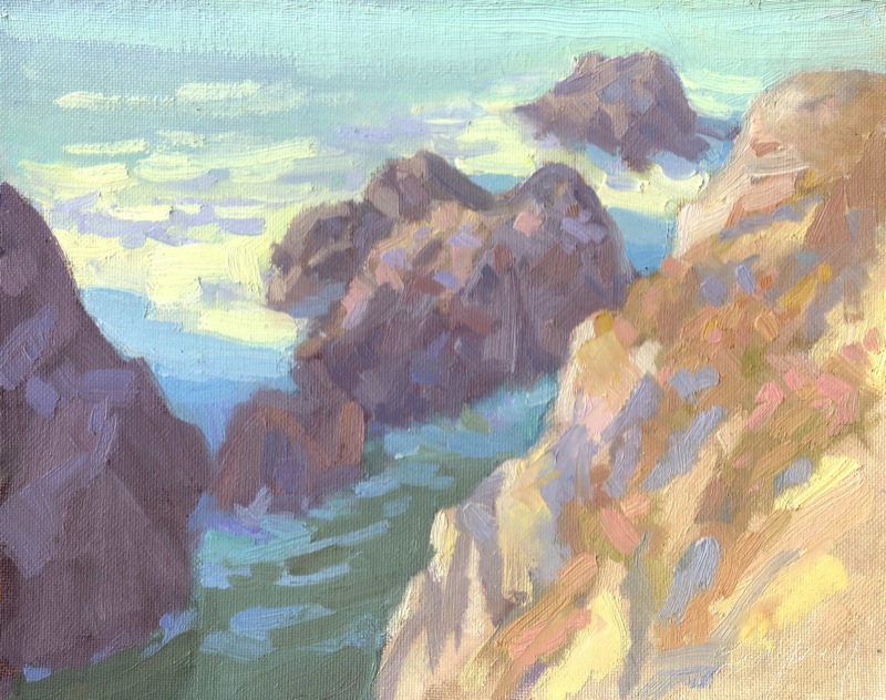
High Key Seascape Study – Oil on Canvas – 8×10

Here’s a Comparison you may find interesting
|
|
|
| This is how I typically handle a subject like this, with a full range of pigments from the darkest I can create to the lightest. For the feeling I wanted to convey, it works: the saturated color is lively, and high contrast adds drama. Where it falls short is light. Do you get a sense for what the light was like that day? | This is a new “high key” approach I’m experimenting with, used by painters like Dale Axelrod. The values are kept much closer together, and saturation is kept to a minimum. i think this approach gives a better sense of light and atmosphere. It’s not as exciting as the full key painting on the left, but it’s purpose is different. It calms. |
Also, here are some examples of high-key and full-key paintings from Bato Dugarzhapov, a Russian artist I greatly admire:
| Full Key |
High Key |
 “Maestro” by Bato Dugarzhapov |
 “Three graces” by Bato Dugarzhapov |
 “Shady nook” by Bato Dugarzhapov |
 “Almond-tree” by Bato Dugarzhapov |
Other artists who often paint in a high key, include: Dan McCaw, Peter Bezrukov, Dale Axelrod and Quang Ho (see 1, 2, and 3).
Interesting exercise. I also use very dark values with strong highlights, but like the all over light paintings. The mode is very different in the lighter paintings. Very up lifting and airy. It will be interesting to see how you incorporate this into your painting.
Yes, if I can continue to develop out this technique, I’d like to see it as just another tool in my painting toolbox. It does help convey specific moods, such as the light-filled airy atmosphere that you mention.
Great idea for an exercise. I believe I’ll try it today!
Very helpful to see these side by side. Thanks for taking the time to show the difference as it id very helpfule for folk new to the oil painting world. Beautiful too by the way! Best, /Lee
I feel that the high key is what I’d tend to look for, but only time will tell. I need to get out and try some of the ideas I’ve picked up here.