Sunday was warm, clear and little wind, so a great day to paint the coast. I wandered over to an area I like generally referred to “Lands End” (here’s a Google Maps aerial view).
On days with clear sky, you’ll notice that the shadows are quite blue as the sky color reflects directly on shadowed flat planes. This was really easy to see on this day, particularly since the white water provided the perfect platform for viewing clearly the color. One art teacher used to have us place a white piece of paper on the ground, part in shadow, part light, to judge the color of shadows and light that day. The other observation I had was the color of the light, and again, the white water played the role of that white paper on the ground. The color of light was yellow, and of course as the afternoon progressed, it picked up more orange (I finished this in about an hour).
Painting a single monolithic object is a challenge compositionally. I certainly didn’t want to place the large rock in the center of the canvas. I used the “thirds approach“, and so placed the center of interested at roughly the verticle and horizontal thirds of the canvas. Once I’d decided on the lower right, I needed to balance the space out with other rocks. Luckily, the lower left rock was actually there, but I improvised others. I dulled out and simplified the top half of the painting to provide a neutral backdrop for the lower half center-of-interest, high-saturated colors.
Another challenge here was the fact the rock was multi-colored. I couldn’t really tell whether the top was white from “bird contributions”, or weather it was a different type of rock. Probably the former. With the top half white, and the bottom warmer earth colors, I needed to ensure the light and shadows read properly. So, the shadowed side of the top of the white rock had to read as white in shadow. I needed to keep it just slightly darker than any of the planes in light. I also needed to ensure I didn’t duplicate that color with the white water shadow color. I’m always very careful not to repeat two color/value combinations in a painting for different objects. It doesn’t (rarely) happen in nature, so it shouldn’t here. The shadow side of the white rock is a dull, blue violet, whereas the white water has more saturation and color variation.
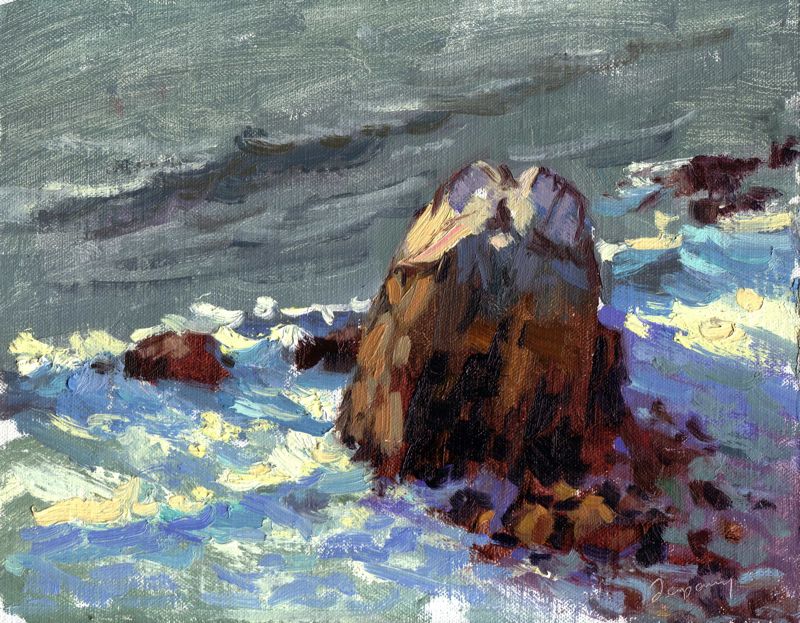
Seal Rocks Beach, San Francisco – Oil on Linen – 8×10
I am headed to Russian River today for the weekend, and hope to get some painting done along the coast, or who knows, maybe figures around the pool at the RRR!