Two more seascape studies, each with their own lessons.
In this painting of bluffs, I’m focusing on my grays and aerial perspective (distance). I tend to paint too dark, so I need to paint more studies like these. I focused on including very subtle warm/cool color variations, and show just a hint of light on the second bluff in (towards the middle). I remember a technique Barry John Raybould taught me: you take a base local color for an object, then divide it into three. Depending on the color, you mix a warm, cool and more neutral version of the base color, adjusting each new color to keep all three the same value. When you place these slight variations on the canvas, you create movement for the eye.
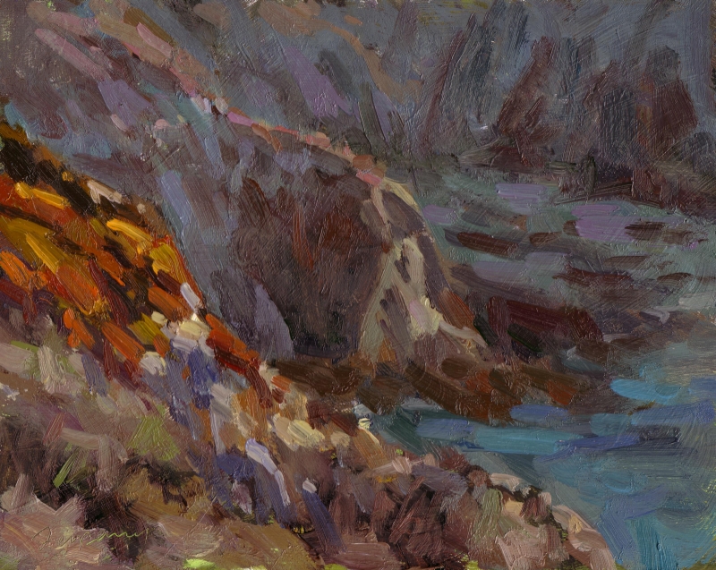
Shadowed Bluffs – Oil on Panel – 8×10
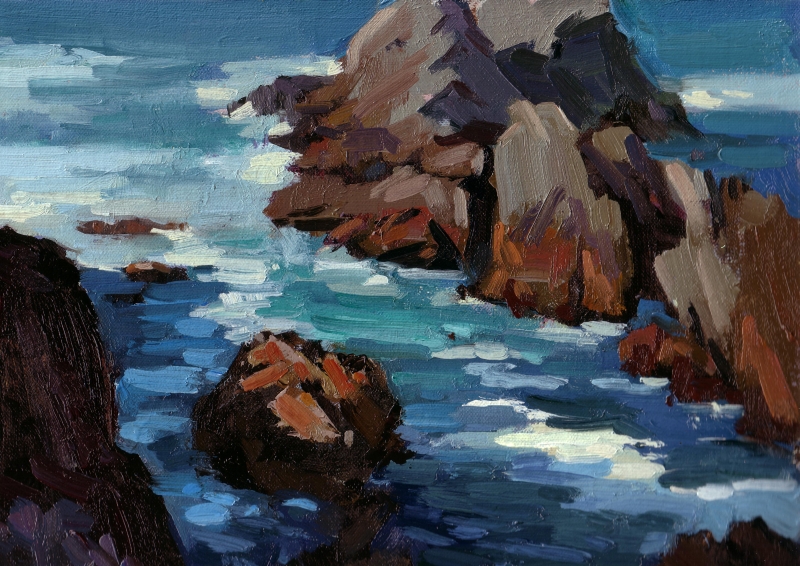
The atmosphere in this next study was completely different: a clear, afternoon light (around 2pm). I was working on a couple of challenges in this study.
First, I wanted to accurately convey the difference between the water and white water in both light and shadow. This takes a very careful study of value. The white water in shadow is quite light, yet not as light as the deep water in sun. The middle/left side of the painting shows a cast shadow from the bluff (it intersects the small rock). I pushed the differences there to get it to read properly. i did the same in the bottom right of the painting.
Second, I wanted to ensure the different types of shadows in the rocks read properly. For example, in the top right of the painting, one rock’s (on the left) right side is in shadow, but it’s facing the sky, so you’ll see the shadow is much cooler (and lighter) that the shadow next to it. That rock’s face was more verticle, so didn’t face the sky. As a result, it’s much darker and cooler.
Third, I wanted to show distance. One element that’s common in both the distance (top of the painting) and the foreground is the water and foam. You’ll notice that as the water moves back in space, I define less and less of the edges and color variation. I think it reads well, but not as well as Camille Przwodeck, who’s really good at this (see here and here). I am studying with Camille in Hawaii in February, can’t wait (join us)! The other element in common are the rocks. Again, I kept my most intense colors, sharp edges and color variation for the foreground rocks.
Great posts, Ed! Thanks for all the encouragement this last year! Best to you for the new year.
really like this one, lots of vibrance and motion. I hope you dont mind I added your link to my blogroll.
Thanks, Sally, for both the encouragement and blog roll addition!