Another study, based on my photos of Venice. I enjoyed painting this one a lot. I enjoy mixing the subtle earthy tones of old buildings or nature with man-made shocking colors, like the clothes hanging to dry here.
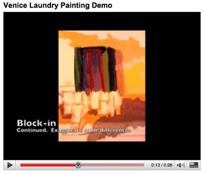
The photos aren’t great (taken with my camera phone), so when this finishes drying (in the Wedgewood Stove, as always), I’ll take a digital scan. I strung together four photos of the work in progress, imported into iMovie, and made a short video now on my YouTube channel.
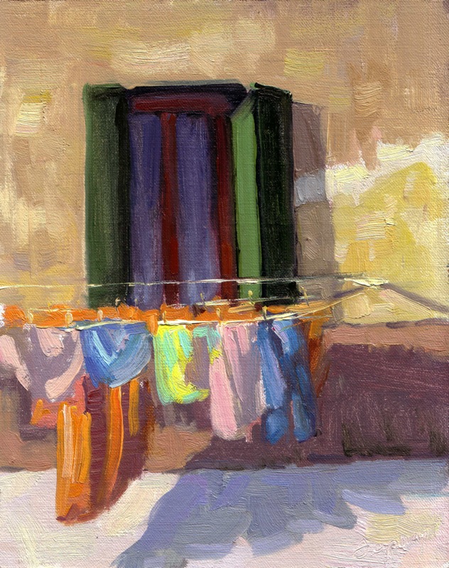
Venice Laundry – Oil on Linen – 10×8
AVAILABLE IN MY ONLINE STORE FOR $150 ![]()
One area I really focused on, to make the light “read” well, was the difference between light and shade across subtle color shifts. To see what I mean, look at the shadow cast by the open green window shutter. See the difference in the building’s color and texture, from a yellow at the bottom, then a white crack patch (not yet painted), then an older ochre color to the top. It was critical that I got the shade/light relationships working across that plane. I think I did it, but let me know what you think. I’m less sure about that darn green shutter in full light. It’s just not sitting right. Perhaps it’s too cool? What do you think?
Click on this image to get to the YouTube video. Enjoy!