“It is in the contrast of light and dark that design happens.” – Helen Van Wyk
This is part 7 in my series of 10 “top observations” on painting…although I think a few more may crop up 🙂
First a definition: In art, “value” is the range of grayscale from white to black, generally thought of in a 1-9 scale (1 being white, 9 being black). It has been said that the eye can discriminate no more than 9 distinct grays. Why are values important? The root of our visual system is value, not color. We saw in grayscale before color (according to the evolution of our visual systems).
Control of values is the most challenging technical aspect of painting, at least for me. I’m continuously learning and honing this skill. Values are important for two reasons:
- Design. A strong value structure forms the basis for a good composition/design (see “Work in Abstractions”);
- Representing Reality. you can’t truly have fun with color unless you get the value right. I’ve had more than one colorist master tell me, “it doesn’t matter what color you paint something, as long as the value is right”. I’ve found this to be true: if you’re values are correct, the painting will “read” correctly.
When I’m having a problem with a painting, I’ll often go through the process below to determine if the values are correct. This can be done both plein air using a digital camera in the field, or in your studio on a PC.
- Take a digital photo of your subject, being careful to get a good balance of values–eg, center your view on an area with both darks and lights, to get a good average. This is more difficult that most realize. Cameras–even digital–tend to over-darken the darketst darks and white out the lightest lights. Taking a digital photo with the correct value balance is an art in itself.
- View the photo in grayscale. Most digital cameras allow you to modify your image on the camera in this way. If not, transfer the image to your PC and use photo editing software to convert it to grayscale.
- Take a digital photo of your painting, again, being careful to get the right balance of values.
- View your painting in grayscale.
- Compare your painting and reference photo in grayscale. Do they match?
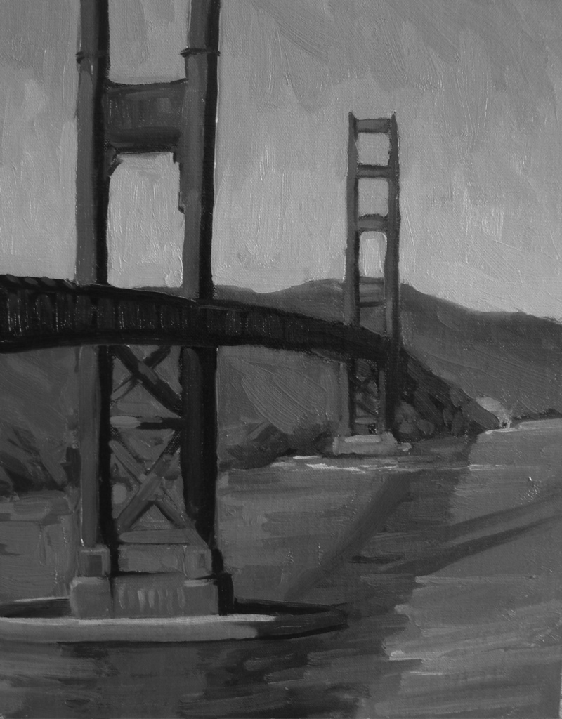
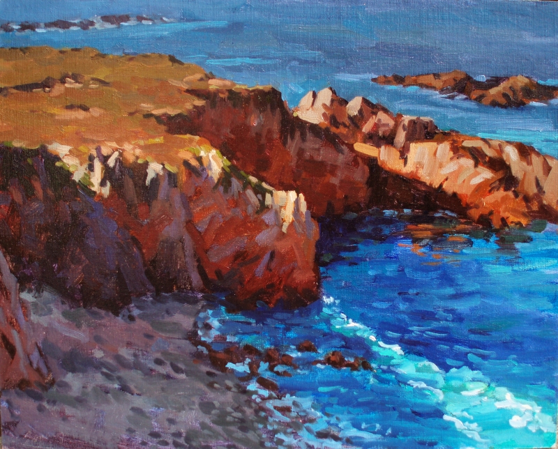
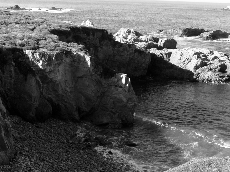
Although I’ve included the color versions below, the key comparison to make are the black and white images, the reference photo on top, my in-progress painting below. This schene is basically a simple three-value design, with some highlights (light) and accents (darkest darks) here and there.
This is the first layer of paint–I expect to add one more. The key question I had when I decided to analyze this painting was: is the value of the light side of the bridge correct? Is the value of the cast shadow on the water correct? Reds are particularly challenging to paint in the correct value–don’t know why, but that’s my experience.
Compare the value of the distant hills with the bridge in light, bottom left of the black and white reference photo. They’re almost exactly the same. Surprising, when you see my color version, which has a distinct vibrant difference (probably due to the red/green complementary color change). Because the colors were so vibrant, it was difficult for me to tell if the red was the right value, turns out I got it right. The cast shadow of the bridge (which I think makes this painting interesting), is also the correct value when seen in grayscale. What’s incorrect–and this surprised me–was the concrete pier base of the bridge in the foreground. It’s not nearly light enough. Knowing this, I can correct the painting’s value structure and finish it off with bridge rigging and other possible detail.
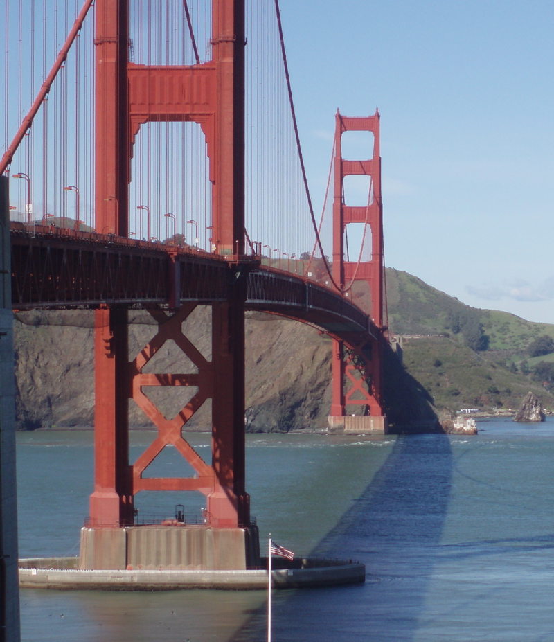 Reference Photo – Color |
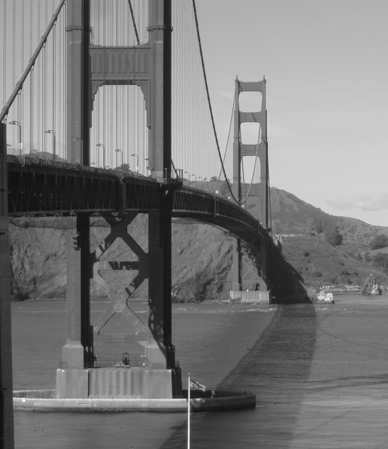 Reference Photo – Black & White |
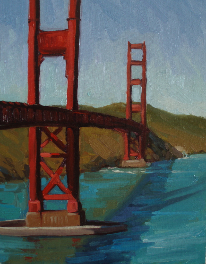 My Painting – Color |
 My Painting – Black & White |
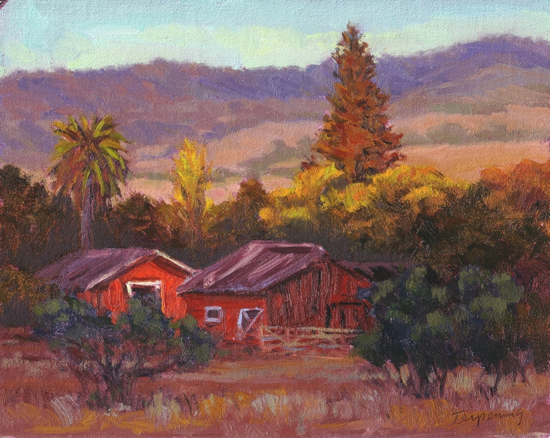
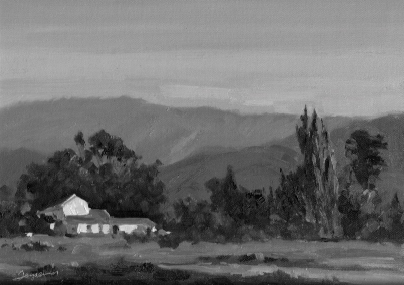
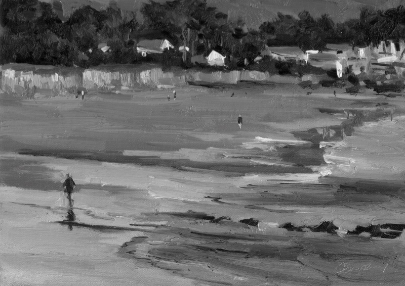
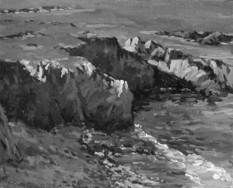
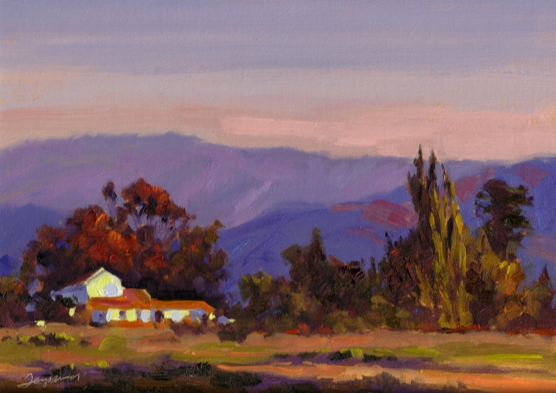
Here are some of my own paintings in grayscale, to illustrate the value of a distinct blocks of value in painting to build strong design. Color versions are also available, as well as some reference photos when available.
Other resources on this topic
Thanks for the great explanation and b/w :color demo pic’s. Your colors are so beautiful and now I see why your paintings “read” so well. The values are so correct and well designed.
I too have been studying values lately and found another good resource on the topic in a link from your site here to that of Charles Sovek.
On his site he has a section “Lessons from the Easel”. Lesson #7 is a neat chart and exercise to mix a 5 value and 9 value scale. Even more helpful (for me anyway) was Lesson # 19 “Understanding Color Values” which is an exercise in matching colors (hues) with corresponding values on the 9 value scale.
I was sorry to read that this great painter has recently passed away. His work and teachings are wonderful.
Sometimes when I’m out painting and don’t have my digital camera, I use a red toned sheet of plastic film (like a red-colored plastic sheet protector) as a value finder. The red tone neutralizes the colors and reduces them to a sort of red “gray scale” of pure values. Your digital camera and PC system is better but this is a cheap, “low tech” alternative that I’ve found useful sometimes.
I never tire of seeing what’s new on your site. Beautiful paintings and useful information. Thanks!
Kay Schneider
Ed,
Truly the most challenging component of my painting journey has been developing good values. This is a great topic and I’m glad you are sharing this with us. The Bridge paintings are just like an exercise that Marc Hanson has us do in his workshops. I just completed my second one with him a couple of weeks ago. It’s the same principle. We set up and choose what we want to paint and mask off a 12×16 board into fours. The first block is for a 3 value black and white. The second block is that same black and white with halftones added into each value. The third is the the same as the first but with color notes instead of grays. And the fourth is when we add the color halftones. A great exercise. Doing one of these every couple of weeks would help us all become better painters I bet.
Tim
I noticed that when I post photos of my paintings on my blog the dark and light values are exaggerated. You said, that when taking a photograph of our painting we should center our view on an area with both darks and lights to get a good average. Do you mean that a digital camera will read the values more accurately that way? Or is this a technique to judge our values during the painting process?
Hey Ed! This is really solid stuff! Too bad it is such a mystery to some folks. Keep up the great work!
Mike
The PDF artist’s color/value matching chart is a great resource! I made a high quality print out to us in the studio. Nice.
Yes, Kay, isn’t that chart interesting? I haven’t decided whether to try using it or not. It’s a bit too scientific for me, I think.
Kay, yes, I’ve tried using a piece of blue plastic to view a scene (and painting) in a sort of gray scale, and I’ve seen other artist’s like you use red as well. Thanks for reminding me of this, it’s a great easy way to create a similar effect, although the camera is more accurate.
Tim, I’m glad you brought up Mark Hanson–his work is fantastic. Also glad to hear he also happens to be a good teacher, as it sounds like his technique is quite analytical–which I prefer. Have you ever blogged about his technique? I’d love to see some photos of the process you describe.
Silvina, the process I described is how I get the camera to adjust its aperture to the average value, to try and avoid lights that turn to white and darks that turn to black. I use this technique both photographing my art and taking reference photos. I can be very tricky. I typically hold down the photo button halfway and move the center around until the image I see in the viewfinder most closely matches reality. It takes some practice. Also, I don’t paint from printed digital photos, but rather photos projected on a television in my studio (connected to my Mac, or camera directly). This illuminates the photo beautifully, even the darks.
Ed,
This was a very interesting post. I happened to be struggling with a value related problem and used your technique to help solve the problem. I hesitate to depend too much on technology but I must admint, this worked well. I think that getting the values right may be the most important aspect of realist painting.
Thanks again for being such a generous resource.
Some excellent work, will keep checking the site out from time to time.
Happy painting
Pochade.co.uk